Data Visualization gives us a clear perception of the data by using maps or graphs. Data Visualization forms the data more natural and easy for humans to understand trends, patterns, and outliers within large data sets. So if you want to learn Data Visualization and looking for some Best Data Visualization Courses Online, then you are in the right place. In this article, I am gonna share the 20 Best Data Visualization Courses Online.
- 1. Data Visualization with Tableau Specialization- Coursera
- 2. Data Visualization with Advanced Excel- Coursera
- 3. Data Visualization– Udacity
- 4. Data Visualization with Python-DataCamp
- 5. Information Visualization Specialization-Coursera
- 6. Data Visualization with Python- Coursera
- 7. Interactive Data Visualization in R- DataCamp
- 8. Data Visualization and Communication with Tableau- Coursera
- 9. Understanding and Visualizing Data with Python- Coursera
- 10. Learn Data Visualization with Python- Codecademy
- 11. Data Visualization- Coursera
- 12. Tableau 2026 Certified Associate Exam Guide A-Z (w Datasets)- Udemy
- 13. Data Visualization in Tableau– Udacity
- 14. Complete Tableau Training for Absolute Beginners– Udemy
- 15. Introduction to Power BI– DataCamp
- 16. Creating Dashboards and Storytelling with Tableau– Coursera
- 17. Data Science: Visualization– edX
- 18. Microsoft Power BI for Analysts– The Pluralsight
- 19. Fundamentals of Data Visualization with Power BI– edX
- 20. Tableau | A Quick Start Guide– Udemy
In Data Science, you have to showcase your findings in a visual form, so that stakeholders can understand them properly. This is an important step in Data Science. That’s why the knowledge of Data Visualization is important. And for that, you should be familiar with data visualization tools like ggplot, matplotlib, Seaborn, and D3.js.
You should know various Reporting tools like Tableau and power bi. These tools have in-built visualization reporting tools.
Before I discuss Best Data Visualization Courses Online, let me tell you by what criteria I have filtered these courses-
Criteria-
- Rating of these Courses.
- Coverage of Topics.
- Engaging trainer and Interesting lectures.
- Number of Students Benefitted.
- Good Reviews from various aggregators and forums.
So, without further ado, let’s start finding Best Data Visualization Courses Online.
Best Data Visualization Courses Online
1. Data Visualization with Tableau Specialization– Coursera
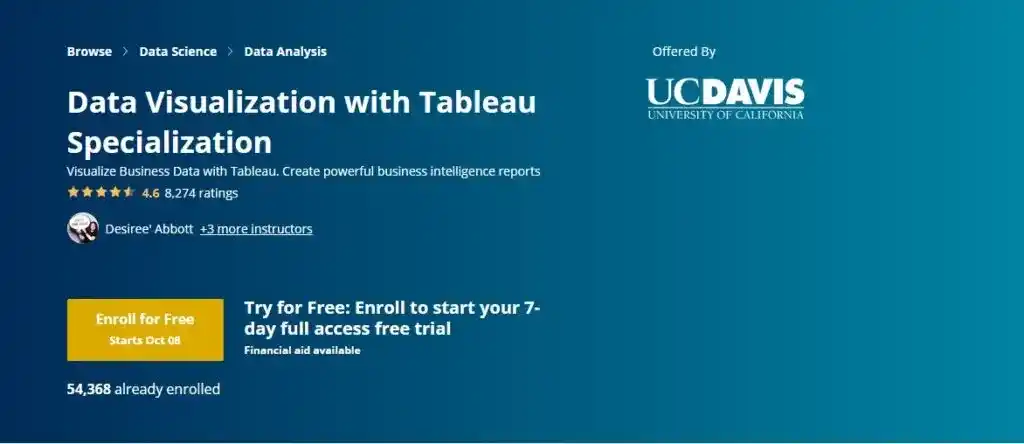
Rating- 4.6/5
Provider- University of California, Davis
Time to Complete- 6 months (If you spend 3 hours/week)
In this specialization program, you will learn Data Visualization with Tableau. Tableau is the most powerful, secure, and flexible end-to-end analytics platform for your data. Audi, Bank of America, Amazon, Burger King, EY, and Kimberly-Clark Corporation are a few of the top companies using Tableau
This specialization program is dedicated to newcomers to data visualization with no prior experience using Tableau. In this specialization program, you will see examples from real-world business cases and journalistic examples from leading media companies.
After completing this Tableau Specialization program, you will be able to generate powerful reports and dashboards. And this will help people to make decisions and take action based on their business data.
This Specialization program is a 5 Course Series. Let’s see course details-
Courses Include-
- Fundamentals of Visualization with Tableau
- Essential Design Principles for Tableau
- Visual Analytics with Tableau
- Creating Dashboards and Storytelling with Tableau
- Data Visualization with Tableau Project
Skills Gain-
- Storyboarding
- Map
- Tableau Software
- Data Visualization (DataViz)
- Data Virtualization
- Visualization (Computer Graphics)
- Data Analysis
- Visual Analytics
- Interactive Visualization
Extra Benefits-
- You will get a Shareable Certificate and Course Certificates upon completion.
- Along with that, you will get Course Videos & Readings, Practice Quizzes, Graded Assignments with Peer Feedback, Graded Quizzes with Feedback, Graded Programming Assignments.
Now, let’s see whether you should enroll in this specialization program or not?
You Should Enroll if-
- You are a beginner in data visualization but comfortable in working with data and datasets.
Interested to Enroll?
If yes, then check out all details here- Data Visualization with Tableau Specialization
2. Data Visualization with Advanced Excel– Coursera
Rating- 4.8/5
Provider- PwC
Time to Complete- 15 hours
This course will teach data visualization with Excel. Throughout the course, you will learn how to visualize data, tell a story, and explore data by reviewing the core principles of data visualization and dashboarding.
In this course, you will create complex graphs and Power View reports by using Excel. To complete the assignments of this course, you should have MS Excel 2013 version on your computer.
Now, let’s see the syllabus of the course-
Syllabus of the Course-
- Preparing a Professional Excel
- Advanced Scenario Analysis
- Data Visualization
- Dashboarding
Extra Benefits-
- You will get a Course Certificates upon completion.
- Along with that, you will get Course Videos & Readings, Practice Quizzes, Graded Assignments with Peer Feedback, Graded Quizzes with Feedback, Graded Programming Assignments.
Now, let’s see whether you should enroll in this course or not?
You Should Enroll if-
- You are a beginner and want to learn data visualization with advanced Excel 2013 functions.
- Make sure you have MS Excel 2013 version on your computer.
Interested to Enroll?
If yes, then check out all details here- Data Visualization with Advanced Excel
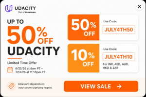
3. Data Visualization– Udacity
Rating- 4.7/5
Provider- Udacity
Time to Complete- 4 Months (if you spend 10 hours/week)
This is a Nano-Degree Program offered by Udacity. In this program, you will learn how to build data visualizations and dashboards. After this, you will learn to draft presentations using storytelling techniques, visualizations, and animations. Now, let’s see the syllabus of the Program-
Syllabus of the Program-
- Intro to Data Visualization
- Dashboard Designs
- Data Storytelling
- Advanced Data Storytelling
Extra Benefits-
- You will get a chance to work on Real-world projects from Industry Experts.
- You will get Technical mentor support.
- Along with this, you will get a personal coach & career services,
- Interview preparations,
- Resume services,
- Github review,
- LinkedIn profile review.
Now, let’s see whether you should enroll in this course or not?
You Should Enroll if-
- You are familiar with descriptive statistics, like median/median/mode, variance and standard deviations, and distributions.
- You should also know how to analyze data in spreadsheets.
Interested to Enroll?
If yes, then check out the details here- Data Visualization
4. Data Visualization with Python–DataCamp
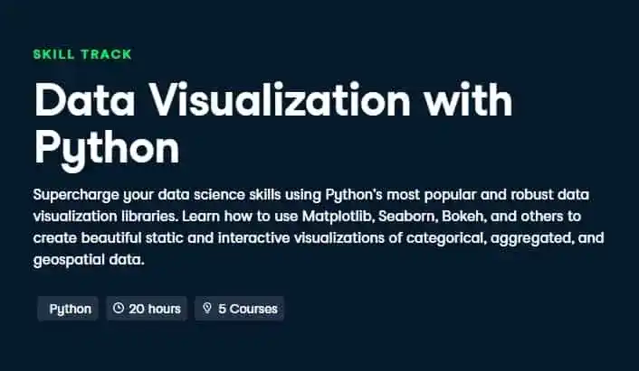
Time to Complete- 20 hours
This is a skill track offered by DataCamp. In this skill track, there are 5 courses. These courses will teach you data visualization with Python and its most popular libraries Matplotlib, Seaborn, Bokeh, etc.
In the first course, you will learn how to visualize data using Matplotlib in plots and figures exposes the underlying patterns in the data, and provides insights.
The second course provides an introduction to Seaborn and teaches you how to visualize your data using plots such as scatter plots, box plots, and bar plots.
In the third course, you will learn how to construct compelling and attractive visualizations that help you communicate the results of your analyses efficiently and effectively.
The fourth course teaches Bokeh, an interactive data visualization library for Python. In the last course, you will learn how to make attractive visualizations of geospatial data with the GeoPandas package.
Who Should Enroll?
- Those who have some prior knowledge in Python and want to learn Data Visualization with Python.
Interested to Enroll?
If yes, then check out the course details here- Data Visualization with Python
Note- If you want to learn Data Visualization with R programming, then you can check this skill track- Data Visualization with R
5. Information Visualization Specialization-Coursera
Rating- 4.7/5
Provider- New York University
Time to Complete- 4 months (If you spend 3 hours/week)
This is another Data Visualization course, where you will learn how to select the correct visualization tool for a given data analysis and presentation problem. This specialization will help you to gain the required knowledge and practical skills to develop a strong foundation in Data Visualization.
In this specialization program, you will create data visualizations using D3.js. There are 4 courses in this specialization program-
Courses Include-
- Information Visualization: Foundations
- Information Visualization: Applied Perception
- Information Visualization: Programming with D3.js
- Information Visualization: Advanced Techniques
Extra benefits-
- You will get a Shareable Certificate and Course Certificates upon completion.
- Along with that, you will get Course Videos & Readings, Practice Quizzes, Graded Assignments with Peer Feedback, Graded Quizzes with Feedback, Graded Programming Assignments.
Now, let’s see whether you should enroll in this specialization program or not?
You Should Enroll if-
- You have basic programming experience.
Interested to Enroll?
If yes, then check out all details here- Information Visualization Specialization
6. Data Visualization with Python– Coursera
Rating- 4.5/5
Provider- IBM
Time to Complete- 18 hours
This course introduces a range of data visualization techniques like line graphs, pie charts, bar charts, and specialized visualizations like Waffle and Folium. In this course, you will learn various data visualization libraries in Python, namely Matplotlib, Seaborn, and Folium.
Now, let’s see the syllabus of the course-
Syllabus of the Course-
- Introduction to Data Visualization Tools
- Basic and Specialized Visualization Tools
- Advanced Visualizations and Geospatial Data
Extra Benefits-
- You will get Course Certificates upon completion.
- Along with that, you will get Course Videos & Readings, Practice Quizzes, Graded Assignments with Peer Feedback, Graded Quizzes with Feedback, Graded Programming Assignments.
Now, let’s see whether you should enroll in this course or not?
You Should Enroll if-
- If you have some previous knowledge in Python. This course is a bit challenging for a beginner.
Interested to Enroll?
If yes, then check out all details here–Data Visualization with Python
7. Interactive Data Visualization in R– DataCamp
Time to Complete- 20 hours
This is another skill track offered by Datacamp. In this skill track, there are 5 courses. These courses will teach you how to create Interactive Data Visualization in R.
In the first course, you will learn how to create maps using the IPEDS dataset, which contains data on U.S. colleges and universities.
The second course teaches how to create and customize interactive graphics in plotly using the R programming language. You will also review data visualization best practices.
In the third course, you will extend your understanding of plotly to create animated and linked interactive graphics, which will enable you to communicate multivariate stories quickly and effectively.
The fourth course teaches how to visualize big data in R using ggplot2 and trelliscopejs. In the last course, you will learn rbokeh: a visualization library for interactive web-based plots.
Who Should Enroll?
- Those who have some prior knowledge in R and want to learn Data Visualization with R programing.
Interested to Enroll?
If yes, then check out the course details here- Interactive Data Visualization in R
The next course in the list of Best Data Visualization Courses Online is-
8. Data Visualization and Communication with Tableau– Coursera
Rating- 4.7/5
Provider- Duke University
Time to Complete- 25 hours
In this course, you will learn how to communicate the business-relevant implications of data analyses. You will also know how to streamline your analyses and highlight their implications efficiently using visualizations in Tableau.
Now, let’s see the syllabus of the course-
Syllabus of the Course-
- Data Visualization with Tableau
- Dynamic Data Manipulation and Presentation in Tableau
- Your Communication Toolbox: Visualizations, Logic, and Stories
- Final Project
Extra Benefits-
- You will get a Course Certificates upon completion.
- Along with that, you will get Course Videos & Readings, Practice Quizzes, Graded Assignments with Peer Feedback, Graded Quizzes with Feedback, and Graded Programming Assignments.
Now, let’s see whether you should enroll in this course or not?
You Should Enroll if-
- You are a beginner and want to learn Tableau completely from scratch.
Interested to Enroll?
If yes, then check out all details here- Data Visualization and Communication with Tableau
9. Understanding and Visualizing Data with Python– Coursera
Rating- 4.7/5
Provider- University of Michigan
Time to Complete- 20 hours
In this course, you will learn how to identify different types of data, and learn how to visualize, analyze, and interpret summaries for both univariate and multivariate data. This course will also teach you the differences between probability and non-probability sampling from larger populations.
You will also learn different uses of Python as a tool, including the Numpy, Pandas, Statsmodels, Matplotlib, and Seaborn libraries. Now, let’s see the syllabus of the course-
Syllabus of the Course-
- Introduction to Data.
- Univariate Data
- Multivariate Data
- Population & Samples
Extra Benefits-
- You will get a Course Certificate upon completion.
- Along with that, you will get Course Videos & Readings, Practice Quizzes, Graded Assignments with Peer Feedback, Graded Quizzes with Feedback, and Graded Programming Assignments.
Now, let’s see whether you should enroll in this course or not?
You Should Enroll if-
- You know high-school level algebra.
Interested to Enroll?
If yes, then check out all details here-Understanding and Visualizing Data with Python
10. Learn Data Visualization with Python– Codecademy
Time to Complete- 6 hours
This course is offered by Codecademy where you will learn Data Visualization with Python using Matplotlib and Seaborn. In this course, you will learn how to create line graphs, bar charts, and pie graphs.
You will also learn how to add error bars to graphs, and how to add labels and styling to graphs. This course will also teach you color schemes for your graphs. This course contains 2 courses-
Courses Include-
Extra Benefits-
- You will create 2 Portfolio projects– Sublime Limes’ Line Graph, and Visualizing FIFA World Cup Data with Seaborn.
- You will also get a Certificate of Completion.
Now, let’s see whether you should enroll in this course or not?
You Should Enroll if-
- You know basic Python.
Interested to Enroll?
If yes, then check out all details here- Learn Data Visualization with Python
11. Data Visualization– Coursera
Rating- 4.5/5
Provider- the University of Illinois at Urbana-Champaign
Time to Complete- 15 hours
This course is good for people interesting in visualization, but this course is based on theory. That means you learn fewer details on Tableau software usage and hand-on network graphing tutorials.
The course starts from very basics like which color our eye attracts more. Overall the course covers a lot of ground and introduces some very interesting data visualization concepts.
Now, let’s see the syllabus of the course-
Syllabus of the Course-
- Introduction
- The Computer and the Human
- Visualization of Numerical Data
- Visualization of Non-Numerical Data
- The Visualization Dashboard
Extra Benefits-
- You will get Course Certificates upon completion.
- Along with that, you will get Course Videos & Readings, Practice Quizzes, Graded Assignments with Peer Feedback, Graded Quizzes with Feedback, and Graded Programming Assignments.
Now, let’s see whether you should enroll in this course or not?
You Should Enroll if-
- You want to learn more about theoretical parts of data visualization before learning Data Visualization tools.
Interested to Enroll?
If yes, then check out all details here-Data Visualization
12. Tableau 2026 Certified Associate Exam Guide A-Z (w Datasets)– Udemy
Rating- 4.7/5
Provider- SuperDataScience Team
Time to Complete- 30.5 Hours
In this course, you will learn everything you need to know to pass the Tableau Certified Associate Exam with a perfect score. The best part about this course is that the datasets come from some of the kick-butt companies like- Spotify, The NBA, Rotten Tomatoes, Kaggle, WorldBank, Glassdoor, Airbnb, etc.
In this course, you will learn how to solve Real-Life Business, Industry, and World challenges using Tableau. In short, this is one of the best courses to master Tableau.
In this course, you will learn the following concepts-
- Tableau Fundamentals
- Data Connections
- Organizing & Simplifying Data
- Field & Chart Types
- Calculations
- Mapping
- Analytics
- Dashboards, etc.
Extra Benefits-
- You will get a Certificate of completion.
- You will learn everything to pass the Tableau Certified Associate Exam.
- Along with this, you will get 2 practice tests to check where you stand.
- And you will get Full lifetime access to course materials.
Now, let’s see whether you should enroll in this course or not?
You Should Enroll if-
- You want to Boost your Career by becoming Tableau Certified or if you want to learn Tableau completely from scratch.
Interested to Enroll?
If yes, then check out all details here- Tableau 2026 Certified Associate Exam Guide A-Z (w Datasets)
13. Data Visualization in Tableau– Udacity
Time to Complete- 3 Weeks
This free course will teach data visualization using Tableau. The course begins with the fundamentals of data visualization such as why visualization is so important in analytics, exploratory versus explanatory visualizations, and data types and ways to encode data.
Then you will learn design principles such as how to use chart type, color, size, and shape to get the most out of data visualizations. After learning design principles, you will learn Tableau and basic functions in Tableau, like inputting data and building charts.
This course also teaches how to build Tableau dashboards and how to create visualizations to tell stories with data.
You Should Enroll if-
- You have no programming experience but are interested in using data to make better business decisions.
Interested to Enroll?
If yes, then start learning- Data Visualization in Tableau
The next course in the list of Best Data Visualization Courses Online is-
14. Complete Tableau Training for Absolute Beginners– Udemy
Rating- 4.6/5
Time to Complete- 1hr 54min
This is a Free Course for Tableau on Udemy. In this course, you will learn fundamentals to advanced Tableau concepts. This course will teach automation methods to streamline/eliminate traditional reporting.
You will learn how to choose the right Visualization for the right problem. This course is best for understanding the Tableau Basics.
You Should Enroll if-
- You have no previous programming knowledge and want to learn Tableau.
Interested to Enroll?
If yes, then start learning- Complete Tableau Training for Absolute Beginners
15. Introduction to Power BI– DataCamp
Time to Complete- 6 hours
This is a beginner-level course for Power BI. In this course, you will learn how to explore and use Power BI to build impactful reports. This course will teach you Power BI from scratch.
In this course, first, you will learn how to navigate and get to grips with Power BI’s Data, Model, and Report views. Then you will learn how to create a bar graph and interactive map visualization in Report view. You will also work on hands-on exercises, where you will learn how to filter the information in your reports by location and control how these filters interconnect and interact with other visuals in your report.
You will also work on Microsoft’s formula language, DAX (Data Analysis Expressions) by creating customized calculated columns and fields to better analyze your data.
Now, let’s see whether you should enroll in this course or not?
You Should Enroll if-
- You are a beginner in Power BI and want to learn from scratch.
Interested to Enroll?
If yes, then check out all details here- Introduction to Power BI
16. Creating Dashboards and Storytelling with Tableau– Coursera
Rating- 4.6/5
Time to Complete- 15 hours
This is a Free to Audit course on Coursera. That means you can access the course material free of cost but for the certificate, you have to pay.
In this course, you will learn and work with concepts, tips, and techniques to help you explore data, identify meaningful findings, and then explain them through the power of data visualization and storytelling.
Then you will learn how to set thresholds and create alerts to trigger a decision and learn Tableau’s six best practices for dashboard design.
At the end of this course, you will understand the concepts and techniques designed to help you become a more focused and compelling storyteller with data as the foundation.
You Should Enroll If-
- You are familiar with Tableau and comfortable working with data and datasets.
Interested to Enroll?
If yes, then check out all details here- Creating Dashboards and Storytelling with Tableau
17. Data Science: Visualization– edX
Time to Complete– 8 weeks
This course is Free to audit. In the free mode, you will get access to course materials but not certificates and graded assignments and exams.
In this course, you will learn the basics of data visualization and exploratory data analysis. For data visualization, the R programming package, ggplot2 is used. This course will also teach you how to use ggplot2 to create custom plots, data visualization principles, etc.
You Should Enroll if-
- You have basic knowledge in R programming.
Interested to Enroll?
If yes, then start learning- Data Science: Visualization
18. Microsoft Power BI for Analysts– The Pluralsight
This is a complete learning path of Power BI for Data Analysts. This learning path has three stages- Beginner, Intermediate, and Advanced. And Each stage has some set of courses.
For example, in the beginner stage, you will understand the workflow of creating your first simple Power BI report, and load and shape data for analysis in Power BI Desktop. In the Intermediate stage, you will create complex calculated measures using DAX, and create and share more impactful reports and dashboards from your data.
In the advanced stage, you will leverage advanced Power BI services like Quick Insights and Q&A, and apply powerful data-centric languages against your data.
Now, let’s see whether you should enroll in this path or not?
You Should Enroll if-
- You have previous knowledge in Data analytics literacy.
Interested to Enroll?
If yes, then check out all details here- Microsoft Power BI for Analysts
19. Fundamentals of Data Visualization with Power BI– edX
Provider- DavidsonX
Time to Complete- 2 months ( If you spend 8-15 hours per week)
This is a professional certificate where you will understand the data lifecycle (analyzing, manipulating, and visualizing data) using R programming. Then you will apply what you have learned using PowerBI.
In this certificate program, you will work on business-related datasets and exercises and these exercises will make you more confident in working with data, creating data visualizations, and preparing reports and dashboards in PowerBI.
In this certificate program, there are two courses-
- Analyzing and Visualizing Data with Power BI
- Essentials of Data Literacy
Now, let’s see whether you should enroll in this certificate program or not?
You Should Enroll if-
- You are a beginner and want to learn Power BI.
Interested to Enroll?
If yes, then check out all details here- Fundamentals of Data Visualization with Power BI
The last course in the list of Best Data Visualization Courses Online is-
20. Tableau | A Quick Start Guide– Udemy
Rating- 4.6/5
Time to Complete- 1hr 59min
This Free Tableau Course will provide a high-level overview of the foundational topics in Tableau. In this course, you will learn how to make common visualizations, basic formulas, dashboards, and more.
This course will cover Chart Formatting, Sorting, Filter in Tableau, Math Calculations in Tableau, Charts, Treemaps, and Dashboards.
You Should Enroll If-
- You are a beginner and want to learn Tableau.
Interested to Enroll?
If yes, then check out all details here- Tableau | A Quick Start Guide
So, these are some of the Best Data Visualization Courses Online. Now, it’s time to wrap up.
Conclusion
I hope these 20 Best Data Visualization Courses Online will help you to learn Data Visualization. I aim to provide you with the best resources for Learning. If you have any doubts or questions, feel free to ask me in the comment section.
Tell me in the comment section, which course you like.
All the Best!
Happy Learning!
FAQ
For data visualization, the best programming language is R. R language supports 4 graphics systems viz. base graphics, lattice graphics, grid graphics, and ggplot2. But Python is also a suitable programming language for data visualization. Python has two exclusive libraries for data visualizations that are Matplotlib and Seaborn.
The best part about Tableau is that it doesn’t require any coding knowledge.
You can learn Tableau from online courses. There are lots of courses available online. For Tableau Courses, you can check out this article- 8 Best Tableau Courses Online- Find the Best One For You!
Similar Searches
Best Online Courses for Data Science to become A Skilled Data Scientist
IBM Data Science Professional Certificate Review- All You Need to Know
Applied Data Science With Python Specialization Review- Things to Know
Coursera vs Udemy for Data Science: Which is Better?
Best Course on Statistics for Data Science to Master in Statistics
8 Best Tableau Courses Online- Find the Best One For You!
8 Best Online Courses on Big Data Analytics You Need to Know in 2026
Best SQL Online Course Certificate Programs for Data Science
Best Online Courses for Excel to become an Expert!
7 Best SAS Certification Online Courses You Need to Know
Data Analyst Online Certification to Become a Successful Data Analyst
15 Best Books on Data Science Everyone Should Read in 2026
How to Get a Data Analyst Job with no Experience and with Experience
Data Engineering Career Path: Step by Step Complete Guide
Certification Course for Business Analyst You Should Know
Thank YOU!
Explore More about Data Science, Visit Here
Though of the Day…
‘ It’s what you learn after you know it all that counts.’
– John Wooden

Written By Aqsa Zafar
Aqsa Zafar is a Ph.D. scholar in Machine Learning at Dayananda Sagar University, specializing in Natural Language Processing and Deep Learning. She has published research in AI applications for mental health and actively shares insights on data science, machine learning, and generative AI through MLTUT. With a strong background in computer science (B.Tech and M.Tech), Aqsa combines academic expertise with practical experience to help learners and professionals understand and apply AI in real-world scenarios.